Welcome to Writing Children's Books with Robyn Opie Parnell and thank you for visiting.
Earlier this year, my novel Maya and the Crystal Skull was released by R & R Books Film Music. Maya and the Crystal Skull is the first book in a series for confident readers aged 9 and older.
Earlier this year, my novel Maya and the Crystal Skull was released by R & R Books Film Music. Maya and the Crystal Skull is the first book in a series for confident readers aged 9 and older.
Early in 2013, the second book in the series will be released. The second novel is Maya and the Daring Heist. More on the story later.
Right now, I'm hoping you can do me a favor and help me choose a cover for Maya and the Daring Heist. I have five alternatives, which makes a decision difficult for me. If you let me know your choice of cover either in the comments or via email, I'll greatly appreciate your feedback.
Maya and the Daring Heist is a children's book, so please ask your children to add their vote either in the comments or via email.
To make this activity more interesting, I'm giving away a copy of Maya and the Crystal Skull to a lucky person who votes on the cover by leaving a comment or sending me an email. My husband will randomly choose a winner from the comments/emails on 4 August 2012.
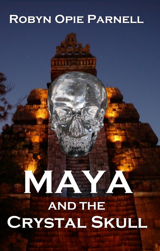
In my opinion, a series should have a consistency in appearance. So to help you pick a cover for the second book, here is the cover for the first one Maya and the Crystal Skull.
To further help you, Maya and the Daring Heist sees our lovely heroine Maya King once again caught up in the adventure of a lifetime when a priceless crystal skull is stolen from the British Museum and Maya is unwittingly used by the thieves to smuggle the crystal skull out of England. When Maya realizes she has a stolen crystal skull in her possession, she wants to return the priceless artifact to the British Museum. The thieves are intent on stopping Maya at any cost.
To further help you, Maya and the Daring Heist sees our lovely heroine Maya King once again caught up in the adventure of a lifetime when a priceless crystal skull is stolen from the British Museum and Maya is unwittingly used by the thieves to smuggle the crystal skull out of England. When Maya realizes she has a stolen crystal skull in her possession, she wants to return the priceless artifact to the British Museum. The thieves are intent on stopping Maya at any cost.
Now over to the potential covers for Maya and the Daring Heist.
 |
| Cover 1 |
 |
| Cover 2 |
 |
| Cover 3 |
 |
| Cover 4 |
 |
| Cover 5 |
Thank you for entering the competition to win a copy of Maya and the Crystal Skull. More importantly, thank you for helping me to choose the cover for the second book in the series Maya and the Daring Heist. I appreciate your assistance. Thank you so much!
The winner will be announced on this blog between 4 and 6 August 2012. Stay tuned!
Please click on the following links for more information about Maya and the Crystal Skull:
All the best to you,
Robyn Opie Parnell
27 comments:
Hi Robyn, I like number 3. It's different but also has the name Maya and your name on the front which is what I'd look for in a series. Marjorie Sawyer
I like #3 and #4.
I like #1 It connects more with the first book :)
However they are all great covers!
Hi Robyn,
I think cover number 2 jumps out at me. The vibrant pink colour is quite striking and really catches the eye. They are all appropriate covers though. Hope the launch goes fantasticly.
Cheer
Diane L Wood
Great covers, Robyn.
I like covers 3 & 4, but I think cover number 1 fits in best with the first book. Good luck with your decision.
Dee:)
Number 2 has it for me. It's striking and the one that gives me most feeling of the character finding it hard to run and escape, and no place to hide, which I understand is a significant part of the plot. I also think the colours and tone relate well to your first book.
Hope it sells heaps!
All best wishes,
Peter
Number two, for sure. :)
Definitely # 1. It has the best backround lighting, and the skull which is brilliant, stands out the best in this one.Good luck!
Hi Robyn,
I like numbers one and five with one being the favorite because it echos the first one, I think. But then that's just MHO.
Looks like good reads though.
Billie
I really like Cover 1. It stands out and is in keeping with book 1. Best of luck.
It's 2 for me, but I considered 1as well.
Cover #1 gets my vote.
For me it was 1 or 5 - I eventually settled with 5 because the Greek statues looked out of place on the front steps of the Museum. Best of luck in choosing a cover - it's a difficult decision!
I like them all, but #1 would be top choice for me. They are all awesome! Best wishes with choosing the cover and with the launch! Much love! - Bryan
Number 2 really spoke to me.
All are impressive but
3 and 4.
I like 3 because it's clean.
4 looks more ya to me. Is that what you want?
if you went with one of them could you rebrand the already published book to match them better?
Good luck with it!
Alison
Number 2 is the one that jumps out for me:-)
Hi Robyn,
these are a fantastic and striking selection. Cover 1 really appeals to me (and it matches as a good follow-up to book one), but Cover 3 is a really good hook to say there's a contemporary girl in this mystery. Also I heard from a publisher once that YA go for covers with real kids. Good luck with your decision.
Chris :)
I like cover 1 the most. 5 the second since they are similar.
Hi Robyn
Number 1 definitely ties best to the first book. Is that the British Museum? However, I also like number four, with the Maya close-up and number two, with its striking colours and sense of claustrophobia. At least I've eliminated two covers!
Cheers
DC Green
Number 1 looks like a different setting, Greek statues make me think of Greece, not Great Britain. No 2 is too vague, no 3 doesn't grab my attention, no 4 is just plain weird with a crystal skull over one of her eyes. The only one that really fit for me is number 5 because that actually is the British Museum. It goes better with the setting of your story.
Number 5 gets my vote.
Hi, Robyn :)
Glad to discover your blog through LinkedIn and your contest!
To me, the only one truly worth considering is #2. If these were all lined, face front, on a store bookshelf, I'd walk right by the other 4, #2 being the only one I'd be compelled to pick up. "Why?" you ask? There are many things to consider, actually, and once I state them, I'm hoping you'll see why there's no contest:
1) The glowing spots (white and pink) being just to the side of the skull, create interest and brighten the center with the lighting from behind the skull illuminating it and reflecting lines against the cave, all drawing your eye to the center, to the skull and the cover itself. It also makes you wonder what the glow is from, drawing you to want to explore---and read!
2) The way the skull is illuminated makes the hollow eyes stand out and boosts the eery quality. Their "whiteness" also helps the text pop, along with the fact that the background is dark enough and not busy, making the title and your name very readable at a glance.
3) Everything about the passageway is compelling: its narrowness presses on you and pulls you in; it's so ancient, you're lured to explore, especially up a STAIRCASE you KNOW leads to SOMEthing you HAVE to discover.
4) It sparks the imagination and curiosity.
To me, the other covers do none of this; they are relatively ordinary. I'm also not one who likes covers with actual photos of people because it paints the character as that specific person. I prefer more faceless images, or at least not close-ups like in #4. The girl in #3 is more distant, so that doesn't paint too clear an image of the face. Not that it matters 'cause, to me, for all the reasons I explained, #2 is the ONLY choice :)
Hope this helps!
Donna
My 9 year old daughter and I both prefer #4. Faces are always attention grabbers. Best of luck with your new book!
I like cover 4 as the girl's eye just shows through the skull and looks interesting. I think this would appeal to new readers of your series, especially children. However cover 1 is the closest to the theme of the other book in your series - so, for anyone who has read that, cover 1 might be more appropriate. Good luck with the choice and the launch.
Robyn,
I think cover #1 is the nice contrast and compliments your current cover.
Just my opinion. Good luck with your choice.
Donna
Donna's Blog: http://www.donnaodonnellfigurski.wordpress.com
Donna's Website: http://www.donnaodonnellfigurski.com
Book Reviewer: http://www.smartwriters.com/content/blogsection/4/52/
Hey, Robyn, I like cover #1. Unless it's a romance, I'd stay away from characters on your cover. Cheers!
Hi Robyn,
When i dowse I get that #5 wil be best received by your audience :)
Good luck selecting!
Post a Comment